Sunday, May 15, 2011

Creating Tension


This painting, measures 20x16, has one theme or idea--tension. The bow of three boats intersect, one source of tension, but the more obvious source are the two fisherman. I constructed these to pull in opposite angles. Of course, they are doing something--more interesting than standing stiff and upright, one of my pet peeves in figure painting. What do you see of interest?

Secondary interest points might be the background where light is suggested and very high key compared to the dark green boat. There are clashing colors as well with cools and warms. Also note the big shapes-I tried to place outstanding loose color in complimentaries. So contrast in shapes, color and figures help to make this painting interesting.

Something I have not used is edge variation--soft and lost edges that could be employed to make this even more successful. Also the pink hi key water is unusual from the more common blue or green water. When you use unusual color in an area you will create interest-the viewer will have to compute and think--either this is damn good or terrible but it least it makes them think--that is good so use unusual color schemes whenever possible.

That is about it. I am tired from a week workshop with Calvin Liang. Very good stuff and I recommend him highly. Next time I will discuss color theory with Munsons color wheel.

Tuesday, April 26, 2011

Persistense-Keeping dogs around


Ken Backhaus,a member of the Plein Air Painter of America. once told me to keep my bad paintings around, I will learn more. The painting top left is one that sat around in my studio over a year. There was a third boat in the middle, making it cluttered and the sky was the same tone as the boats-hence they got lost. In other words, the painting had a lot of problems. Successful art may mean working out a bad design. I am not sure why it took so long but it turns out to be one of my favorite paintings. After I eliminated the middle boat and lightened up the sky-bam, it worked. Everything fell into place. The advice for this column is that if you did a painting that isn't quite right, keep it around for a while, maybe you can work out the kinks.

Of course, you can ask friends or a teacher how to improve it but sleep on it, ask yourself what it needs;play around with some paint telling yourself no big deal, if it doesn't work, you can wipe it off and start all over again. That is the luxury of oil paints compared to watercolor which is a do or die thing. The second part of the lesson is persistence; if something isn't quite right, hang in there, maybe you can salvage it as I did. If you don't succeed at first, try try again. I knew the statement I wanted to make but I wasn't doing it then I started to ask myself, "what can I so away with?" What do I love the most? I knew I liked the lower right boat very much. The upper left one had the figure, so I wanted that. Thus, the middle one was gone.Then came the light in the sky, everything began to pop and that was what I was looking for. I can analyze why this painting works but I want to address the intangible-feeling, that a painting may have something you can't put a finger on. One of my dead mentors was Sergei Bongart. I heard one of his students tell me the story when he was shown a very technically correct painting and compared it to a not very good one and he liked the later better. My friend asked why, he said cause the second one has feeling. This is why the Russian impressionists are my favorite--there is passion and feeling in their work. Is strive for this and I invite you to do the same-your work will improve and connect with other people more.

Perhaps that isn't something you thought of before. Lot of people who like my work say it speaks to them, has bright colors. Hopefully it has feeling in it too. Anyway, ask yourself what you feel upon looking upon a painting. If you are reading this blog, you like my work for some reason. I try to put mood or feeling in my work, making it alive.

Monday, April 18, 2011

Design-Uneven Intervals


Greg Albert has written a book on design that deserves mention. His main idea that everyone can remember is no interval should be the same. With this dictum, you can make your paintings stronger. In the Santa Barbara ranch house on the left, you will find a line showing the uneven distribution of lines with the mountain, orange tree (focal point) and dark foreground oak tree. Note the placement is uneven in all respects, including mass size. According to Greg, a painting needs a focal point and a focal area, the former should be the brightest colors and sharpest edges. The Ranch House meets this criteria and the dark oak? Well, that is known as a foil, a device designed to add perspective. It may have been there or I made it up, I can't remember now but it adds an interesting element to the painting.

The coastal rock painting is another example of good placement of masses and line design. The strong dark sharp on the right is one line, distinctly angled differently than the mass on the left, in light. Notice the simplicity in design, this painting is large, 20x24, but effective. Other thoughts in good design--what is the statement? In coastal rocks it is sunlight. In Ranch House, it is mountains. Although the viewer may have different views, at least this was what I had in mind at the time of the painting. Sometimes the statement will be colors, or grandeur or peace and mood. Of course, it can be anything but let your painting state one idea.

Lastly, why do you paint? To create, to fill in time, because you're still in childlike state wanting to play? Is it a calling from higher up? I have toyed with this question since reading Richard Schmid's blog years ago. I know several days without painting and I go slightly insane , blubbering to myself like an idiot. Seriously though, it might be useful to identify your motivation. One time, I went without painting for weeks and I dreamed of eating cad yellow and cobalt blue--after all, they are delicious colors aren't they? Well carry on, if you got something from this, comment. I would like to hear from you.

Tuesday, April 12, 2011

Building a Taboret


After several days of tough manual, skilled labor, my taboret is completed. I did mine in Maple, a hard wood that will last and not ding or sag easily. One of my mentors, Brian Blood, who was gracious enough to send me his plans, had this in oak and I loved it. Picture this, all the room for oil paints, big pallet (18x30 or 40 if you want). Shelving underneath for extras, nice open draws for tubes and brushes. This is the quintessential accessory for your studio. It took about 80 bucks in wood and screws and , of course, a home styled carpenter (me) so if you're good with your hands and have some power tools, make it yourself. Otherwise, I have the plans above or can email them to you so your friend or hubby could do it.

Be mindful that Taborets cost from 400 to 3000 so this is an expensive equipment but if your painting big, like I am, something like this is a necessity. Another teacher, Terri Miura has a smaller version ( his is shorter than me, I am six foot) that is about one third mine so you can modify it to suit. I like the large brush washer to the right and have added ( not in pic) a lower shelf and paper towel holder.

Welcome to new (friends) fans and hope you learn from this blog. I will discuss motivation later, but I am in a funny funk. I did really well in my last show, ( Indian Wells, ca) so I don't want to paint from fear that I can't do that good again. Usually, I am in a funk because I did so poorly, whats the use (hopelessness). Anyway now I have such high expectations of myself, I am nervous about not doing really good art. Go figure, I am like a yo-yo inside-a typical melodramatic nut. It was really nice to get away from art and build this table for myself--A complete distraction.

If you're like me, you an art addict, at it every day, new ideas, creating, fun. But I have also been pushing myself to improve the last few months, studying from other artists, etc and my bar is really high now ( and so is the pressure). I will return to painting today but what frustrates me is I want to bat 1000 percent. It just doesn't work that way ( meaning I want all my paintings to be a success). Charles Movalli, a painter back east once alluded to the outcome of successful art being one in twenty. So okay, I am not perfect and no artist is ( even Monet had paint overs). I must accept that and move on and be ready to wipe off failures. I don't have clue what this does to building taborets but it is a nice side topic to discuss. Perhaps you have issues like this. Please comment, I would like to get a dialogue going so we can discuss these issues and all learn and grow to become better artists. The beauty of cyberspace is that we are a artist community--around the world-- and can help each other.

Wednesday, March 23, 2011

Wild Color


Farm animals are a subject matter that brings joy to many people. It also can be an excuse to get really wild with color. For example, Roosters have a variety of color, usually very harmonious and fun. But also, notice I have not abandoned basic principles, like values. All good artists will always keep a sound value structure (also called Notan) in order for the subject to read well.

In the painting on the left, I have neutralized the background because there is so much color in the rooster, anything in the background would fight with the main thing, Mr Rooster (or the foreground). Also, the brush strokes mimic the direction of the feathers. Most impressionists or contemporary painters are not going to paint 5 million feathers--boring and not an exciting product. By suggesting, you invite the viewer into the painting to finish the process. By defining out everything, it is boring because I can see a photo by myself--who needs the artist. Therefore, by massing in the main body and softening the edges, you create the feeling of feathers to impliment the sense of reality in this bird.

Another tip on brushwork, keep the brush strokes large and loose whenever possible. Create a shadow even if it is not there. Drag the brushdown (or up) and away to create the whispy (feather feeling) on the bird. Of course, the colors on this guy were great. Ask yourself, are the colors (or strong blacks and white) interesting. Look and observe--there are subtle blue greens (I used Viridian) or burgundy (quinacradone rose is good) within this animal. Build in strong contrasts by making the background opposite the foreground. For example, if the bird is black, make it white. If white, darken the background with grass, barns, etc. Be sure and put dabs of these strange and unusual colors that are typical in roosters. Small note--have a leg up, adding movement as opposed to simply standing still. Can you have any more fun that this? Let me know if you enjoyed this painting or information. Next time I will show a portrait of a cow.

Thursday, March 3, 2011

Design

12x16 Pacific Grove Iceplant Right, actual area

Reconstructing from nature is important when considering design- the interesting placement of objects and material so the eye can go back into a painting and enjoy and its unique characteristics. The painting Ice Plant, below , didn't look that way. In fact, you can see the actual landscape on the photo in upper right--not much to work with, huh? There was a big blob of ice plant on the right with a nice shadow but that was it. By making a path and having the upper left trees go back via graying pushing them into the distance, I created a much more interesting picture than mother nature gave me. The tree on upper right I pulled down, forward and enlarged it. I also developed a path so the eye would go up and back. In other word, don't be a slave to what is front of you. Move things around, push em back or forward for interest.
Paul Strisik was well known for this. He was an artist back east, died some 10 years ago but he would have a most boring bottom third of a painting before him and changed it to fit his design. One student asked me if it was okay to change the subject in front of him-not only is it okay but important and necessary. You are the creator in your painting--occasionally mother nature drops you jewels where you needn't change a thing, but that is not the rule. Enlarge, shrink, push back your subjects to arrange a better composition. The rule is have a way to get into a painting, leave and stay in a painting. You will have better art that way.

Monday, February 14, 2011

Figures en Plein Air


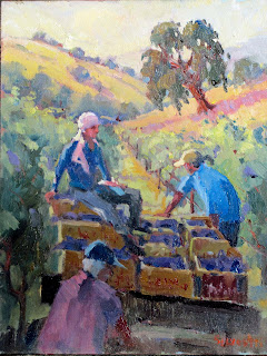
This painting, Harvest, is only 11x14, as a primer for a larger piece. When including figures in your work, you want to think of several things. Do the figures look cutout? Sometimes there is failure to bring the prevailing light into the colors in the figures. If the sky is mostly yellow, make sure you place that color in your figures. Of course, the second consideration is correct drawing--do the figures have a gesture (bend or curve that is natural and interesting.

Often the mistake beginners make is that they are too stiff. Have them doing things. I ask myself what is she doing, how is he holding onto the load, does it show the weight, balance, etc. Arrangement; are the people is a pleasing order, low to high, forward and backward. Is my painting successful in this category. One painting I remember from my trip to Russia is how the impressionists would use figures as a lead in. Very unusual in western art, yet highly interesting technique.
Perhaps equally important is what direction are the figures looking. Have them go in different directions, most of which go into the painting, not out. My own preference is to keep them loosely painted. That doesn't mean throw proportion out the window but try doing two strokes for an arm instead of ten. Suggest, don't over define--that will take the life from the painting. Are the skin tones dark enough with warm tones that indicate truth or honesty. Perhaps workers aren't cool to put into the painting. I think they are but that is my personal preference.
Finally, look for harmonies in the entire painting. The example on the left has a secondary color scheme- orange, violet and green. Therefore, to have your figures pop, use a primary like blue. While I might push some of the secondary colors into the blue to make it connect, it stands out because blue is non harmonious. Can I get away with this nonharmony? Of course, in fact it breaks up the secondary scheme somewhat but make sure it doesn't destroy the harmony in the overall painting.
Mass distribution? That is an important principle. Notice I have the wagon sliding to the right. It might be too precarious if I didn't have two things to counter balance it--the worker in blue holding it up and the tree upper right tilted to the left. These small things make it balanced in my opinion. You may disagree but I like things unevern. Brings in excitement and dynamism..
To sum, consider the following factors when bringing figures into your paintings: prevailing light color, perspective, gesture, overall harmony, mass distribution, dynamism, and facial direction. Use warm skin tones and suggest, don't tickle with the brush and overdefine. Okay, that is about it. I know it sounds like a lot but I have been studying this stuff for 20 years and my knowledge mounts up. Read Andrew Loomis on figure drawing and illustration; free on line PDF file. If you do these things, your paintings will improve. Good luck and remember my critiques via email. Having a teacher assist you can be an invaluable process.