Saturday, December 4, 2010

Positive Art Thoughts


Since reading Jack Whites book, Fear of Art, I have been struck by the valuable contribution of he and others who address thought patterns as they relate to the world of art. In my own thinking, I have negative thoughts like, " I can't paint what I want" or, " I can't make it successfully, I will have lots of paintings and store them up so after I die, they will discover me". These and other negative, victim type thoughts are actually prescriptions for how I live my life. Obviously, they have negative consequences. I have been identifying these and canceling them with improved positive thinking like," I can paint anything I want" and " I can be successful in my art and financially sound" and " Who cares after I die, let's make it now" . I am not sure where these will lead me but they will probably have a better outcome than the former.
I had a student ask me, "Can I paint this?" Of course you can paint anything you want, I fired back. Many of us who came from moderate or severe dysfunctional childhoods were shamed when we were young, stifling our inner urges, creative intelligence (psychologists finally have labeled this as an valid indicator of "smarts", and ability to express ourselves. These old messages can be replaced with new messages that are upholding, validating and supportive. Try saying, You are well loved, You can do anything you want to do, or you are a creative talented person, capable of great art! Such new positive thoughts are bound to take you to a better outcome than shame based thoughts. I have notice an improvement in my work since I began this program a month ago based in Joyce Meyers book, Power Thoughts, where she encourages this process from a Christian perspective. I will put a plug in for my ongoing favorite blogger Stapleton Kearns. He writes daily and on artists I have always admired (Sargent, Zorn, etc) and topics of great relevance. Check him out. Let me know if this helps you by commenting.

Monday, November 1, 2010

Whimsical portraits


Perhaps because of the season, Halloween, I am extra whimsical in this painting showing the Venice Carnivale, a time in spring where everyone dresses up in masks and historical italian costumes. I love the colors and unique masks that are somber, erie, yet provoking and interesting. Note how the mask follows the same undulations as a persons face, yet is removed and strangely beautiful. There is the minimal amount of "landscape" where the figures dominate. There are two distant figures and a gondola so everyone knows where this is (Venice, Italy). Keeping the hands soft was a huge challenge, something Bye Bytney taught me, it is known and deconstruction; you paint or render the object, in this case hands and a purse, then scumble over it to eliminate edges. The end product becomes mysterious and suggestive, making the viewer go to the more interesting parts of the painting. Impressionism leaves so much room for experimenting. If you don't like the look, render it again. Don't ever be afraid to go over and over a painting; one thing Dan Hatfield teaches gained from James Singer Sargents notes, but not to the point of killing the spontaneity. Also, note the amazing amount of interest just by a cook, angle of the head that is facing you. These small gestural tweeks can add so much to a painting, keeping it life like. People angle their head, not everyone keeps it stiff and upright. In my class on Fridays, we have a live model where I now teach the subleties of portriature but abstracting the portrait, as in this painting, is such a fun, good exercise.

Friday, October 15, 2010

Counterpoint in Composition


I am doing this blog on developing oppositional lines and angles within the structure of a painting. While doing a show in Utah, I was exposed to the work of Steve Sanger, a Park City artist who has multiple pitches in his paintings. This creates a fluid, poetic motion in a painting and is difficult to create without forethought. To obtain this motion, one must start with a line up from left to right, then have a focal point back to the left so the eye zigzags if you will. Always have curves, it is a counterpoint in direction, not light as the term often implies. This kind of motion has a singsong effect, good movement and captivates the viewer better than straight lines going in the same direction. Notice the green and earth tones are not even clear. Are they grass, vines, ? Who knows, leaving it abstract in the bottom third of the painting leaves mystery because you don't want the viewer to spend time there, merely open the door for them. This is an 11x14 (sold) of a Murphys, California vineyard. I have had this in mind for over a month, then saw this scene and immediately got out of the car and painted, esp difficult because my wife was in the car. Sometime I will do a blog on spouses (oh how they suffer) that you may want to share with yours. New classes starting up in Newcastle, Auburn area so join us!! Live model to draw and paint!! So, in sum, design your painting with curved lines that sway back and forth for a more interesting product.

Thursday, September 9, 2010

Myths of Plein Air Painting


One myth about plein air painting is that artists setup their easel and paint in one and a half hours. Sometimes true but other times a particular subject may take a year or more in the making. The subject to the left, settlemeyer ranch, in one example of the latter. I found this very difficult and didnt tackle it until a year or more in my brain. Maybe I needed to be inspired more to do a white house with shadow. Maybe I needed confidence to do a soft mountain in the distance. Maybe increased skill in water. Maybe all the above, but the point is, while I have painted outside for 15 years, I am still growing and learning. A studio artist asked me, after painting outside for three years, if I had it down (learned all there is to know about outside air painting) and now get to the serious business and paint back in the studio. I hope and don't think I will ever get it all, that I continue to understand reflections in water, under the bushes, softness in the mountains, etc. There is so much to observe in mother nature that I will always look to understand more. The point of this message is to give yourself time. Don't compare yourself to others and their progress. Maybe you need two years to master a particular subject area. Respect Your growth and progress, get help from others. ( I offer critiques over the net) And that professionals who win awards for their art (like myself) often struggle and, at best, hit about 300 percent, that is about 3 out of 10 are good paintings. We don't sit down and pound out a winner after winner. I try to paint every day. The painting above, done in Gardernville, Nevada, was completed on the way to my annual study of the sierras. More to be posted on that later. So paint outside, study, fail, and allow time to acquire skills.

Tuesday, August 24, 2010

Education, Portraits, and Blab


For some time, I have wanted to elucidate (explain) the purpose of art education. Is it helping the student to arrive at a pretty picture? Is it more? I would hope so. Robert Henri explains the purpose thusly; Development of a strong perosnal art...through stimulating in students a more profound study of Construction, Proportion, Drawing---stimulating activity, mental and physical, moral, courage, invention in expression to fit the idea to be expressed;the study of specific technique, impressing the importance of the idea, that it must have weitht, value, be well worth (work). The development, therefore, of artists of mind, philosophy, sympathy, courage, invention. ...Individuality of thought and expression is encouraged. (p.224, Henri, 1923.) Wow, isn't that awesome? Now, what does it mean? The student should be devoted to the point where the teacher may "destroy her darling" , or in other words, wipe off the painting and start over. As painful as that may be, it needs to happen for a variety of reasons--it needs to be redone, the artist must gain ego freedom of her/his work--a sense of detachment for a better product. A painting may need to be redone 6, 7 or more times as the great James Singer Sargent (ala Don Hatfield personal notes) would do.
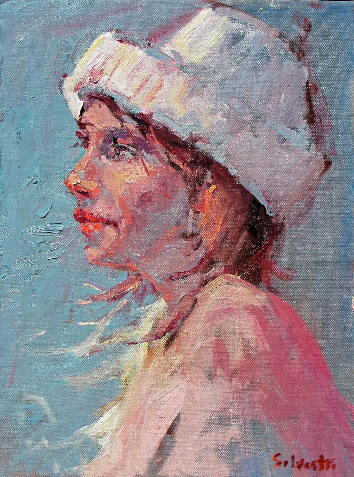
Portraiture, as in the example above, is a passion of mine, perhaps held back. I am not sure why. There are so many good portrait artists but I want to bring to mind what a more contemporary artist, Dan McCaw who says, to develop within the student her/his inner voice, whether is be realism, abstraction or impressionism. That will help the student to stop when they have created the statement they want to create. Without a vision, there is no stopping point and the student begins licking the painting--hitting the paint brush over and over reducing the power of the painting.
The blah in the title of today's blog is how I feel. It is okay, I am in a down zone. Quite normal from what I understand talking to my artist friends. But I wanted to get these ideas out to help other students become clear on reason for studying art. Yes, a pretty picture emerges but from a grasp of technique, ideas, invention, and expression. Develop the latter and the former may emerge.

Monday, August 2, 2010

Design

Alameda Theater, 8x16, $700
This blog is on design--partly because I don't know what else to write about and partly because I read an exciting description of the difference between simply painting what you see and design. My esteemed colleague, Stapleton Kearns makes a distinction by stating, " is an example of a circular composition. I have been talking about designs and said this;
"What I meant was that design is a human construction and can not be copied from nature. You use decision making to add it to your painting. Design is a decision making and not a transcription process. No matter how carefully you copy that which is before you, you won't end up with a designed painting. Design is a construct, a geometric armature upon which you build your painting. I think I will show some examples for a while here. The most important thing I want to teach on this blog, design. Not just how-to, but you-should. You can learn to draw accurately, in fact that is essential. But it is not enough to make a picturemaker of you, only a journalist. " So, the rebellious part of me wants to disagree, because occasionally I will stumble upon an excellent design in mother nature but generally Stape is quite correct. You must think design and instill it as part of your painting construction--note I say construction, not transcription. Otherwise your a journalist, not a oil painter. In Edgar Paynes book on composition, he notes various designs like the 0, S, and triangle but one I will show in this blog is the L design. Simply note how the buidling goes straight up while the people and cars make a line to the left. This design theme can be seen in many great paintings of the past and contemporary artists and has a strong feeling to it. I will write about the rest in future blogs--maybe just quit and refer you to some great blog sites out there that do a better job. Only kidding, had a slow show saturday in Alameda so little in the dumps but will get my mojo up soon. So, think design don't just copy what is in front of you. As my friend Frank Ordaz says, "I always think design" . Have that as a mantra and your art will improve.

Wednesday, July 7, 2010

Russian Still Life


I thought this blog would be on how the Russian artists have influenced me. Upon my visit to Russia several years ago, I found various artists who incorporated antique vases into their art. The florals were super, most prominent is California impressionists is Franz Bischoff who painted wonderful florals. In the painting on the left, I have used red--okay, I admit I am a red guy--there are purple, yellow, blue, and green artists but I am not--I love red so I bring it into a painting whenever I can. The vase is actually from Belgium, on loan from one of my students but the colors are so amazing I thought I would tackle it. Just a few comments on technique-Note the warm cool combination and how the warm background sets off the cool vases. Also, the brush that extends lower left is a lead in, something my favorite artist would do--Sergei Bongart. Other favorite Russians are Surov, Repin, and Levitan. Ilya Repin is like a God over in Russia. You mention his name and heads drop--Equal to the great Russian Poet Pushkin( in fact they were friends). Not to dwell too much on him this morning but the genius of this man was incredible--each painting so different, so well executed that it seemed a different artist painted it. I am convinced a magical, fantasy painting Repin did in the 1930's with underwater sea horses, Merlin the magician and King Neptune served as inspiration for many of Disneys famous cartoon movies of the 50's. I guess I would describe the Russian impressionists, unlike other around the world, is passionate, lively, colorful without losing representational structure. I think real with a strong academic basis, unlike American art in the 1950's and later where modernism took precedance and everyone went Jackson Pollack and splattered paint on a canvas calling it art.
Other technical stuff--note the large small object contrast, how the cloth is handled with little detail, loosely. In the last class, we reviewed the problem with "student" grade paint, namely Winton which is so poor in quality, it simply adds to frustration. Cheapen up on other aspects of the process--brushes, canvas, etc but not oil paint--get the best you can afford. These student grade paints have too much filler, doesn't load or intermix well. Good brands that are affordable include Utrecht, Classic Colors, Rembrandt, Gamblin and Chevrin. Le Franc is quite good as well. I had problems with Pebeo as well so avoid that and Da Vinci--too much filler, waxes, sterates, etc. That is it. Got back from Tahoe on a mini vacation hiking, kayaking, and beaching it. All charged up now. Keep painting, ask questions!!