Tuesday, August 24, 2010

Education, Portraits, and Blab


For some time, I have wanted to elucidate (explain) the purpose of art education. Is it helping the student to arrive at a pretty picture? Is it more? I would hope so. Robert Henri explains the purpose thusly; Development of a strong perosnal art...through stimulating in students a more profound study of Construction, Proportion, Drawing---stimulating activity, mental and physical, moral, courage, invention in expression to fit the idea to be expressed;the study of specific technique, impressing the importance of the idea, that it must have weitht, value, be well worth (work). The development, therefore, of artists of mind, philosophy, sympathy, courage, invention. ...Individuality of thought and expression is encouraged. (p.224, Henri, 1923.) Wow, isn't that awesome? Now, what does it mean? The student should be devoted to the point where the teacher may "destroy her darling" , or in other words, wipe off the painting and start over. As painful as that may be, it needs to happen for a variety of reasons--it needs to be redone, the artist must gain ego freedom of her/his work--a sense of detachment for a better product. A painting may need to be redone 6, 7 or more times as the great James Singer Sargent (ala Don Hatfield personal notes) would do.
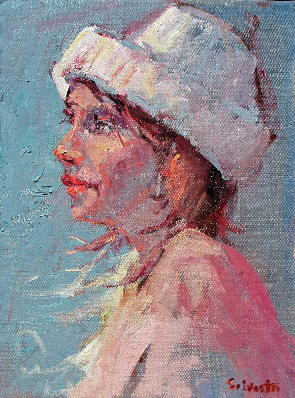
Portraiture, as in the example above, is a passion of mine, perhaps held back. I am not sure why. There are so many good portrait artists but I want to bring to mind what a more contemporary artist, Dan McCaw who says, to develop within the student her/his inner voice, whether is be realism, abstraction or impressionism. That will help the student to stop when they have created the statement they want to create. Without a vision, there is no stopping point and the student begins licking the painting--hitting the paint brush over and over reducing the power of the painting.
The blah in the title of today's blog is how I feel. It is okay, I am in a down zone. Quite normal from what I understand talking to my artist friends. But I wanted to get these ideas out to help other students become clear on reason for studying art. Yes, a pretty picture emerges but from a grasp of technique, ideas, invention, and expression. Develop the latter and the former may emerge.

Monday, August 2, 2010

Design

Alameda Theater, 8x16, $700
This blog is on design--partly because I don't know what else to write about and partly because I read an exciting description of the difference between simply painting what you see and design. My esteemed colleague, Stapleton Kearns makes a distinction by stating, " is an example of a circular composition. I have been talking about designs and said this;
"What I meant was that design is a human construction and can not be copied from nature. You use decision making to add it to your painting. Design is a decision making and not a transcription process. No matter how carefully you copy that which is before you, you won't end up with a designed painting. Design is a construct, a geometric armature upon which you build your painting. I think I will show some examples for a while here. The most important thing I want to teach on this blog, design. Not just how-to, but you-should. You can learn to draw accurately, in fact that is essential. But it is not enough to make a picturemaker of you, only a journalist. " So, the rebellious part of me wants to disagree, because occasionally I will stumble upon an excellent design in mother nature but generally Stape is quite correct. You must think design and instill it as part of your painting construction--note I say construction, not transcription. Otherwise your a journalist, not a oil painter. In Edgar Paynes book on composition, he notes various designs like the 0, S, and triangle but one I will show in this blog is the L design. Simply note how the buidling goes straight up while the people and cars make a line to the left. This design theme can be seen in many great paintings of the past and contemporary artists and has a strong feeling to it. I will write about the rest in future blogs--maybe just quit and refer you to some great blog sites out there that do a better job. Only kidding, had a slow show saturday in Alameda so little in the dumps but will get my mojo up soon. So, think design don't just copy what is in front of you. As my friend Frank Ordaz says, "I always think design" . Have that as a mantra and your art will improve.

Wednesday, July 7, 2010

Russian Still Life


I thought this blog would be on how the Russian artists have influenced me. Upon my visit to Russia several years ago, I found various artists who incorporated antique vases into their art. The florals were super, most prominent is California impressionists is Franz Bischoff who painted wonderful florals. In the painting on the left, I have used red--okay, I admit I am a red guy--there are purple, yellow, blue, and green artists but I am not--I love red so I bring it into a painting whenever I can. The vase is actually from Belgium, on loan from one of my students but the colors are so amazing I thought I would tackle it. Just a few comments on technique-Note the warm cool combination and how the warm background sets off the cool vases. Also, the brush that extends lower left is a lead in, something my favorite artist would do--Sergei Bongart. Other favorite Russians are Surov, Repin, and Levitan. Ilya Repin is like a God over in Russia. You mention his name and heads drop--Equal to the great Russian Poet Pushkin( in fact they were friends). Not to dwell too much on him this morning but the genius of this man was incredible--each painting so different, so well executed that it seemed a different artist painted it. I am convinced a magical, fantasy painting Repin did in the 1930's with underwater sea horses, Merlin the magician and King Neptune served as inspiration for many of Disneys famous cartoon movies of the 50's. I guess I would describe the Russian impressionists, unlike other around the world, is passionate, lively, colorful without losing representational structure. I think real with a strong academic basis, unlike American art in the 1950's and later where modernism took precedance and everyone went Jackson Pollack and splattered paint on a canvas calling it art.
Other technical stuff--note the large small object contrast, how the cloth is handled with little detail, loosely. In the last class, we reviewed the problem with "student" grade paint, namely Winton which is so poor in quality, it simply adds to frustration. Cheapen up on other aspects of the process--brushes, canvas, etc but not oil paint--get the best you can afford. These student grade paints have too much filler, doesn't load or intermix well. Good brands that are affordable include Utrecht, Classic Colors, Rembrandt, Gamblin and Chevrin. Le Franc is quite good as well. I had problems with Pebeo as well so avoid that and Da Vinci--too much filler, waxes, sterates, etc. That is it. Got back from Tahoe on a mini vacation hiking, kayaking, and beaching it. All charged up now. Keep painting, ask questions!!

Saturday, June 12, 2010

Still Life Reviewed


This blog is a followup from my last one where I presented the actual still life, the black and white or notan, value study and now discussing the painting in color. It is imperative to maintain the value structure in this painting because some of these colors are so difficult to get. Trying to obtain the right color mixtures and at the same time as the right value is almost impossible. The student (all of us) must keep the painting in the correct value or all is doomed. What is the shadow color on the main yellow flower to the right middle? Some green, some red, some raw sienna, little yellow, etc, I can't describe all the colors I used--at times I experiment over and over again. The other forms were easier. The background in cool greyed color so they don't compete with the subject matter. The detail in these roses were the most beautiful things I could imagine.
Other notes in still life: Have one flower be the star--if they are all detailed and pretty, you will lose punch. If everyone is screaming in the chorus, who will hear the soprano? Note the lower flower on the table cloth-I angled down so it becomes a lead in. It was straight across the table. Alway look for a way into the painting, and a way out, although keep it subordinate to the lead in. If possible, have two or three flowers touching or off the edge (not in this one) for interest and mystery. Lose edges where ever possible. Let your big masses communicate with each other and make sure there is harmony-especially a balance of warms and cool (there is in this one). More on that in another blog.
Mother nature amazes and humbles me constantly. I hope this helps your understanding of still lifes and take a workshop!! We review these principles and others on fridays.

Wednesday, June 2, 2010

Seduction of Color


This blog is about values-lights and darks and how they affect the structure of a painting. To get depth, contrasts, thus excitement in a painting in working with color, beginning artists get tricked into the beautiful colors. I teach them to stay in the value structure- lights and darks of a painting, starting with darks then moving into lights. With such beautiful color as above, taken during my class last week, it is very easy to become seduced by such rich variety of color, as in the picture above left. The mature artist knows they must first grasp the values or notan ( a Japonese term meaning light and dark harmony) structure as my friend Barry from Virtual Art Academy would say. This notan understands the darks and lights and how they interweave to form an interesting pattern (or not as the subject would display). On the black and white photo on the right, notice the light coming down from middle, then lightly touching the rose in the middle. Nice shadow in front of the vase. Now if this pattern isn't pleasing, adjust the notan, perhaps by darking the rose, the background, or vase, etc. The rich, beautiful color afforded in the still life is a no brainer--beautiful rich variety but the studious artist must hold back, do a value study or take a black and white photo.
Note a new workshop is at Folsom Art Association in 'October 14-16, 2010. Sign up now. One last note is interplay between warm and cools. Does this have a good balance? I think it does, although I might purposefully grey down some of the warm temperature in the background, maybe add a light blue or grey blue to tie into the Vase in the middle. More on warms and cools later. Just saw the impressionists museum last thursday in SF at the De Young museuem--fantastic show, try and see it.

Thursday, May 27, 2010

Figurative Paintings


I am writing to elaborate on my new seascape, harbor paintings that incorporate figures. This painting attached focuses more on light than just color. That interrelationship is complex --certain colors are naturally light in value such as cad lemon while others are inherently dark, tough to show light like dark blue or green. I have had the pleasure of studying with Don Hatfield the last nine months and I have gained mastery over drawing but an increased understanding of color and how it interacts with light. Basically, instead of just white and cad yellow to depict light, I have learned that green, pink, light blue and orange can also depict light if used in high enough value. All these colors, used in conjunction with their respective compliments, can equally show light and how the form principle is employed--the last idea rather old but described very well by Andrew Loomis, in his book from the fifties on drawing and illustration. His dictum, always show the form when describing the figure, is first and foremost. Figures, as opposed to landscape where there are flat surfaces to describe, contain round forms like arms and heads. Therefore, more variation must be shown.
Also, this composition has a certain flow, beginning with the figure on the left, traversing up to the large round net haulers, to the distant light filled fishing boats, then up into the sky. The sky is designed to bring the viewer back into the painting. So I have an eclipse or circular composition. The color, which is usually strong is my paintings. is designed with the light in mind. For some unknown reason, the sea and fishing harbors are romantic and attractive to me so I like painting them.
Hatfield has greatly helped my figurative work so I recommend his classes at S12 Studio in Sacramento. He is very knowledgeable and was trained by Sergei Bongart, in my opinion, one of the greatest painters from the latter part of the 20 th century. His wacky sense of humor and ability to connect to his students is uncanny. He is able to see strengths and weaknesses and display them to students. Russian impressionism seems to have withstood the onslaught of abstraction ism and maintained strong representation principles when the rest of the world went into modern art and lost strong fine art principles from the past.
Also, if you haven't found Stapleton Kearns, I highly recommend his blog. His is very well read, knows his art history, and shows his paintings in various stages. He is a prolific writer and can analyze great masterworks from the past. He is also very humorous and I appreciate him very much. I teach my workshop tomorrow so I hope I have something to say. Please rate this blog above and comment. I like to hear from others.

Friday, April 30, 2010

Having a blast in Napa Valley


Well, this venture into Napa wine country began with an invitation by Don Hatfield to visit his home and studio. Then, since Terry Miura was teaching a class last weekend, we thought we would crash it. Behold, Terry was kind and welcoming, not the least intimidated by our antics and we all met for dinner Friday night. Allan Beribault, a collector and friend, finds these amazing places to paint and, tucked away up in the hillside is Coyote Vineyard with great vistas. The site is amazing, designed by Swedish artist, hand built with tiles and curves everywhere. I preferred the vistas doing the above painting, 16x20 on location en plein air. Quite fun. The class did lots of good art while Don and I ventured up into the hillside to paint. Don got frustrated and drove off not finding a spot and Terry taught his class till I had to leave to go to a show in Alameda. (it bombed cause they charged 60 at the door and only sold 25 tickets). I took some photos and did some smaller studies on my way back on sunday.
If you ever get to Yountville, I am in Heron Gallery, a very nice location run by Dennis and Betty and have some nice pieces of art in there. The light is unusual and, the early and late day, quite extroadinary. Silverado Trail has numerous sights where good composition unfolds yet, near stag's leap vineyard, there are quite extraordinary vistas. Kudos to Don for inviting me and Terry M for having both of us to dinner and paint on Saturday. Both of their blogs are terrific, especially Terry who articulates wealthy tidbits of painting info. Last Tuesday, had a great time at my demo at Folsom Art Association where I explained how I completed the above painting. They had great questions and we laughed so hard, it became impossible to be serious. We covered important aspects of the painting process and had good laughs as well. Thanks to Lori Anderson and Betty for inviting me out there.