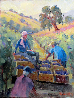
This painting, Harvest, is only 11x14, as a primer for a larger piece. When including figures in your work, you want to think of several things. Do the figures look cutout? Sometimes there is failure to bring the prevailing light into the colors in the figures. If the sky is mostly yellow, make sure you place that color in your figures. Of course, the second consideration is correct drawing--do the figures have a gesture (bend or curve that is natural and interesting.
Often the mistake beginners make is that they are too stiff. Have them doing things. I ask myself what is she doing, how is he holding onto the load, does it show the weight, balance, etc. Arrangement; are the people is a pleasing order, low to high, forward and backward. Is my painting successful in this category. One painting I remember from my trip to Russia is how the impressionists would use figures as a lead in. Very unusual in western art, yet highly interesting technique.
Perhaps equally important is what direction are the figures looking. Have them go in different directions, most of which go into the painting, not out. My own preference is to keep them loosely painted. That doesn't mean throw proportion out the window but try doing two strokes for an arm instead of ten. Suggest, don't over define--that will take the life from the painting. Are the skin tones dark enough with warm tones that indicate truth or honesty. Perhaps workers aren't cool to put into the painting. I think they are but that is my personal preference.
Finally, look for harmonies in the entire painting. The example on the left has a secondary color scheme- orange, violet and green. Therefore, to have your figures pop, use a primary like blue. While I might push some of the secondary colors into the blue to make it connect, it stands out because blue is non harmonious. Can I get away with this nonharmony? Of course, in fact it breaks up the secondary scheme somewhat but make sure it doesn't destroy the harmony in the overall painting.
Mass distribution? That is an important principle. Notice I have the wagon sliding to the right. It might be too precarious if I didn't have two things to counter balance it--the worker in blue holding it up and the tree upper right tilted to the left. These small things make it balanced in my opinion. You may disagree but I like things unevern. Brings in excitement and dynamism..
To sum, consider the following factors when bringing figures into your paintings: prevailing light color, perspective, gesture, overall harmony, mass distribution, dynamism, and facial direction. Use warm skin tones and suggest, don't tickle with the brush and overdefine. Okay, that is about it. I know it sounds like a lot but I have been studying this stuff for 20 years and my knowledge mounts up. Read Andrew Loomis on figure drawing and illustration; free on line PDF file. If you do these things, your paintings will improve. Good luck and remember my critiques via email. Having a teacher assist you can be an invaluable process.